
People are always on their phones, everywhere you look. Smart phones are our conduit to the world, connecting us to friends, family, and information no matter where we are. According to a study this year by Pew Research, 96% of Americans own a cell phone. This means mobile-friendly website designs are necessary in this day and age.
Texas State University is testing a new design for websites with this “mobile-first” ideology in mind. At DOIT we jumped on board to help pilot sites. Our new divisionwebsite is now live, becoming one of a small handful at the university in the new mobile-first template. Eventually, all Texas State websites will have a similar look and feel.
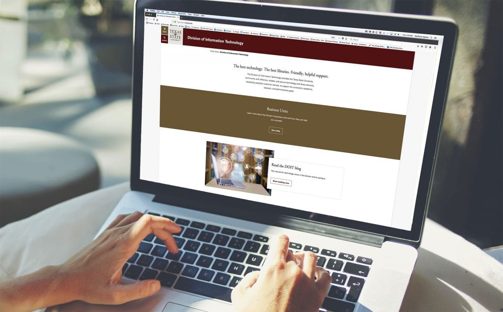
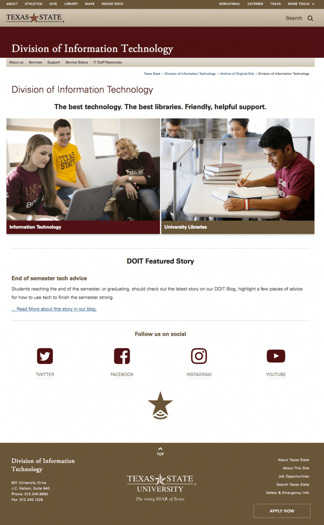
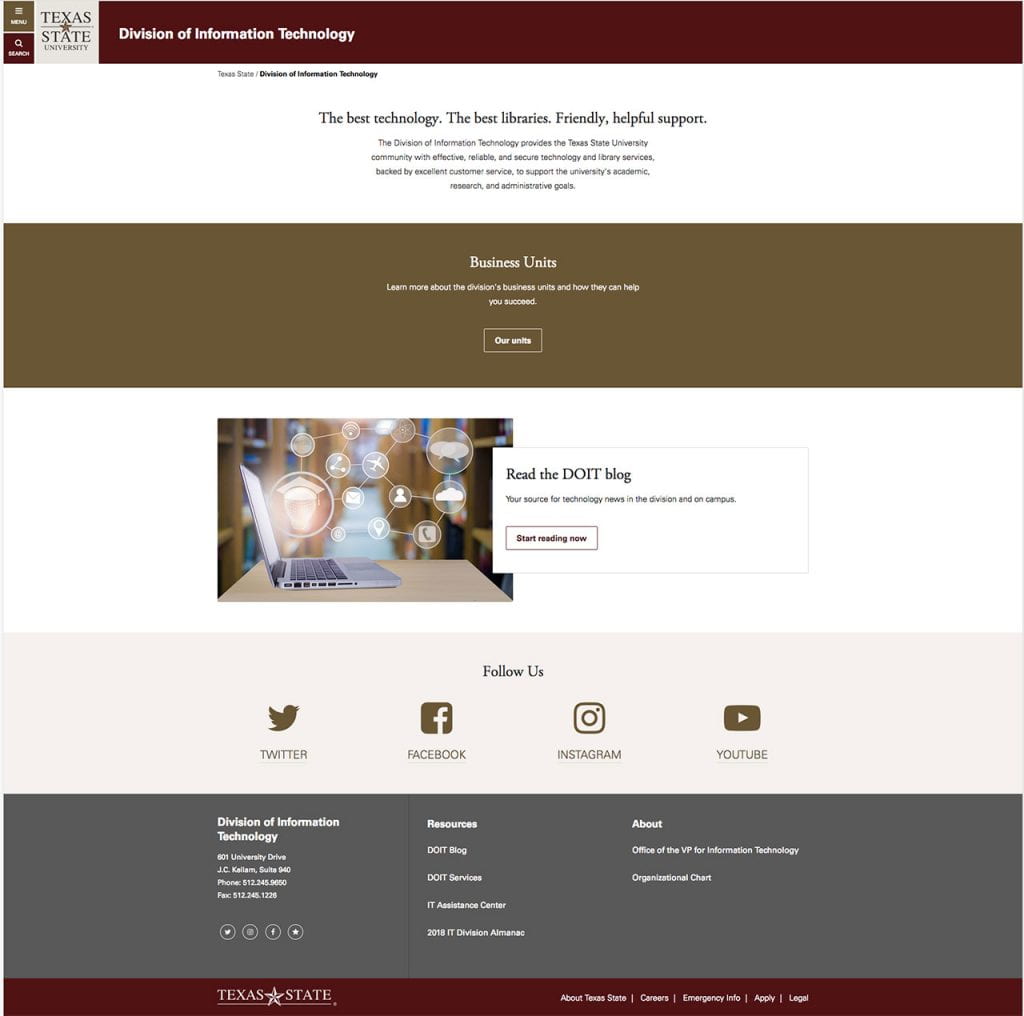
See the before and after redesign look of our homepage below. The new design is more modern and easier to navigate, particularly on mobile. If you want to experience it for yourself, check out our website!
BEFORE:
AFTER:
Steffanie Agnew is the digital marketing strategist in the IT Marketing and Communications office.
