

With online learning, we have had to completely rethink how we communicate. Since we all are depending on our computer screens, it’s important to make sure our digital presentations are engaging and interesting. You have probably spent hours compiling your research, and as a design student I know first-hand that design doesn’t come naturally to everyone, but I’ll let you in on some design basics to get the most out of your presentation:
Try not to use a template
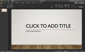
Using a template is easy but can come across as lazy. They’ve been overused, and some templates might not have the aesthetic you are going for in your presentation. Instead, a solid background with great typography is both simple and clean.
Typography

It is hard for viewers to know what is important in a presentation when there is a slide full of text. Instead, keep it short and use no more than six lines of text and focus on the most important talking points. Bullet points aren’t completely necessary, typography is more powerful than you think, and if you keep your slides short and your sentences spaced out enough, your audience will be happy.
I know you might want to get creative and use a fun font, but they usually end up being more distracting, and choosing the wrong type can be the first sign that you don’t know what you’re doing. Sans serif fonts (a letterform that doesn’t have extending features called “serifs” at the end of strokes) are much friendlier on the eyes when reading on screens. Stick to a classic typeface like Helvetica for your presentation.
Color
A big tip for color is ensuring that your presentation has enough contrast. Meaning that there is a big enough difference between the color of your background and your text. This lets your words pop and won’t let any information fade into the background. Any time you need to emphasize something, try using a different color for your text instead. With that in mind, keep your color palette simple and concise and stick to less than five colors. Using too many colors can be painful on the eyes.
Visuals
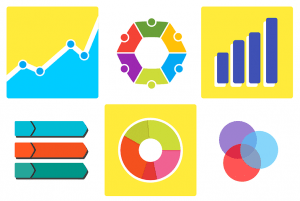
Keep the visuals simple, if you’re going to use images try only one per slide and make sure to keep the image simple. The viewer won’t be overloaded with visuals and the image will complement your presentation nicely. Back up your research with a graph, it is easier for people to comprehend some data with an image.
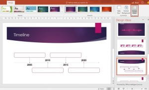
It has taken me years to learn these design tips and effectively integrate them into my work. I know that design is a long process and one that needs to be considered thoroughly, but I also know that others don’t have access to the tools and knowledge of design. As Bobcats, we have free access to Microsoft 365, and in PowerPoint, there is a great tool named Design Ideas that actually helps you to improve slides by automatically generating design ideas to choose from.
Chantal Lesley is a marketing and communications specialist student employee in the IT Marketing and Communications office.
